|
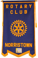
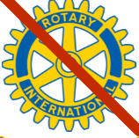
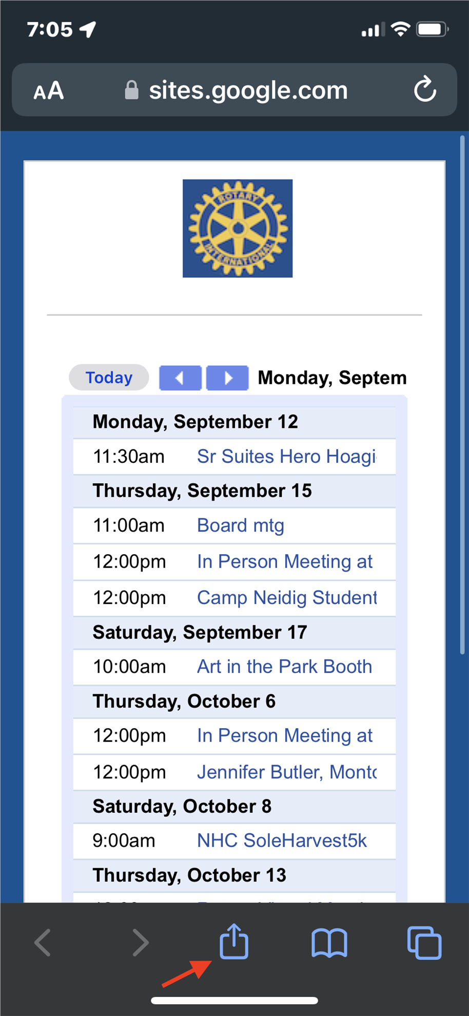
District Image Committee News (Part 1) The following is Part 1 of a 2 part update on what the District Image Committee has been doing. Following the written request just last week from Rotary President Jennifer Jones, we confirmed that we have reviewed our club publications for conformity to current Rotary Branding Standards including logos and use of colors. The newest branding standards were actually adopted by Rotary nearly ten years ago but communication and adoption didn't reach all clubs for quite a while. Also, some things such as plaques bearing logos and some signs, name badges and Rotary pins are not easy to update and some will continue to carry the old standards. Our club has replaced our name badges with smaller badges and with the newer logo. Rotary uses very specific branding and even provides acceptable Rotary logos, fonts and required color schemes. Where Rotary formerly used the yellowish gold gear logo with a blue circle like this. Obsolete Logo The newer logos are the 'Mark of Excellence' and the 'Masterbrand Signature'. The 'Masterbrand Signature' may be displayed by itself. But the 'Mark of Excellence' should always be accompanied by the 'Masterbrand Signature' also. Here is the 'Masterbrand Signature' and 'Masterbrand Signature Simplified'. The 'Masterbrand Signature' may be displayed alone. The simplified version is intended for digital use where logo size does not provide enough detail. Notice the word 'ROTARY" always distinguishes the logo. Here is the second logo, the 'Mark of Excellence' which should be displayed (larger) and always with and near the 'Masterbrand Signature' at all times. Finally, below is the official club logo for our Club generated using the Rotary logo tool in the brand center It uses very specific size, colors and fonts.. Stay tuned for more updates and image information. |







.jpg)

.png)














.png)






.png)